Click here to download this week's dataset as a CSV
Click here to download this week's dataset as a Hyper Extract
Data Storytelling and Data Viz Approach
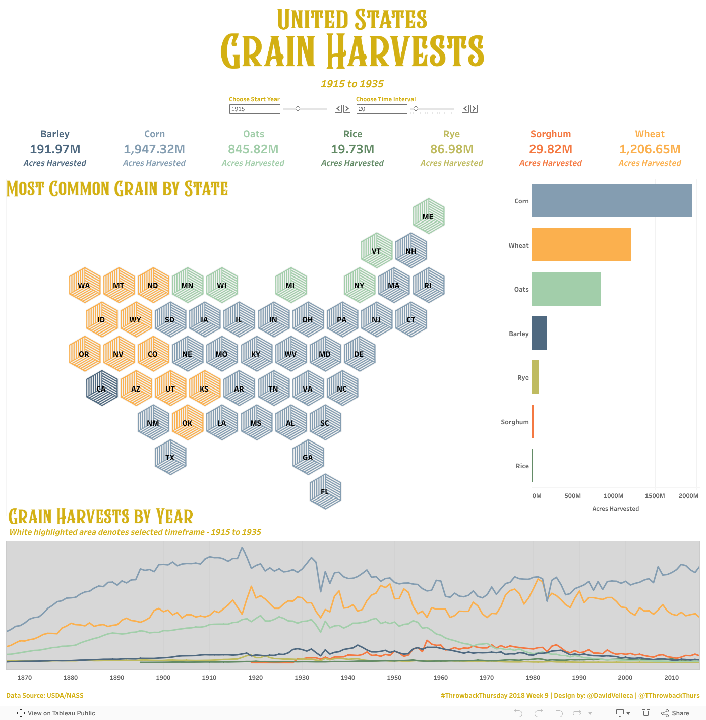
The nature of this data lends itself to mapping. I chose to use a hex map to prevent the relative size of each of the states from detracting from the overall data story. As with most of my visualizations, I strove for interaction - the user can choose a starting year, as well as length of the period to analyze. I achieved both of these with parameters. The users choice then drives all of the visualization on the dashboard.
For the hexmap, I wanted to highlight the most common grain harvested by state for the selected timeframe. I achieved this using a rank (table calc), and filtering this rank to equal 1. To add to the interactivity, I added a Viz in Tooltip to show the acres harvested for all grains. I love Tableau 2018.1's new feature that enables hiding Viz in Tooltip sheets without 'hiding' them on the dashboard.
A nice big set of BANs above the map highlight the number of acres harvested by grain. To enhance the visual aspect of the bans, I also added a bar chart to the right of the hex map. It's a bit of a duplication, but helps to make the map fit the dashboard more appropriately. I finished up the dashboard with a line graph showing acres harvested by grain by year. I used the same dual axis (line and area) technique that I detailed last week to highlight the selected timeframe, while still showing the full data story.
Data Notes
Data is presented as downloaded from the USDA NASS Datatool with the exception of both Corn and Sorghum acres harvested. The data denoted as Corn - Acres Harvested, includes the Grain, Silage and Forage numbers for Corn. Similarly, for Sorghum, the Sorghum - Acres Harvested includes the Grain and Silage numbers.
Data Source
This week's data source comes from the United States Department of Agriculture, National Agriculture Statistics Service. The picture this week is of the wheat field behind my house.